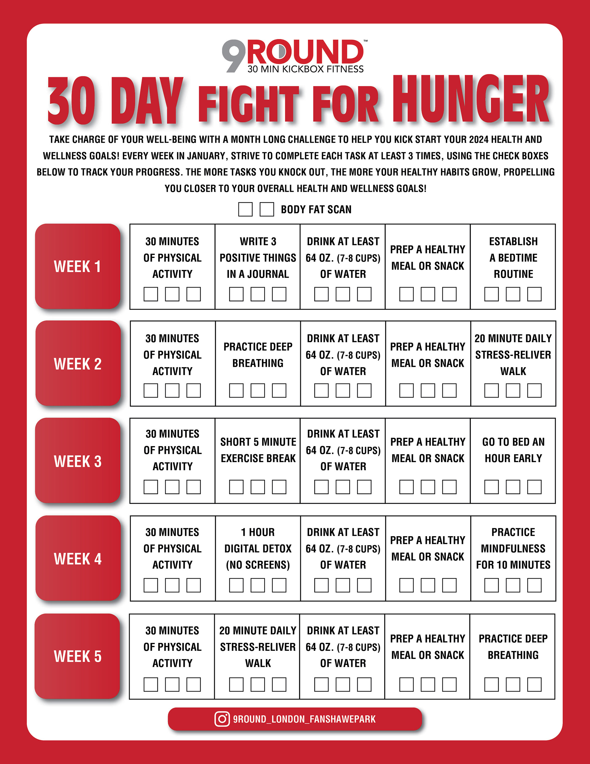
Objective
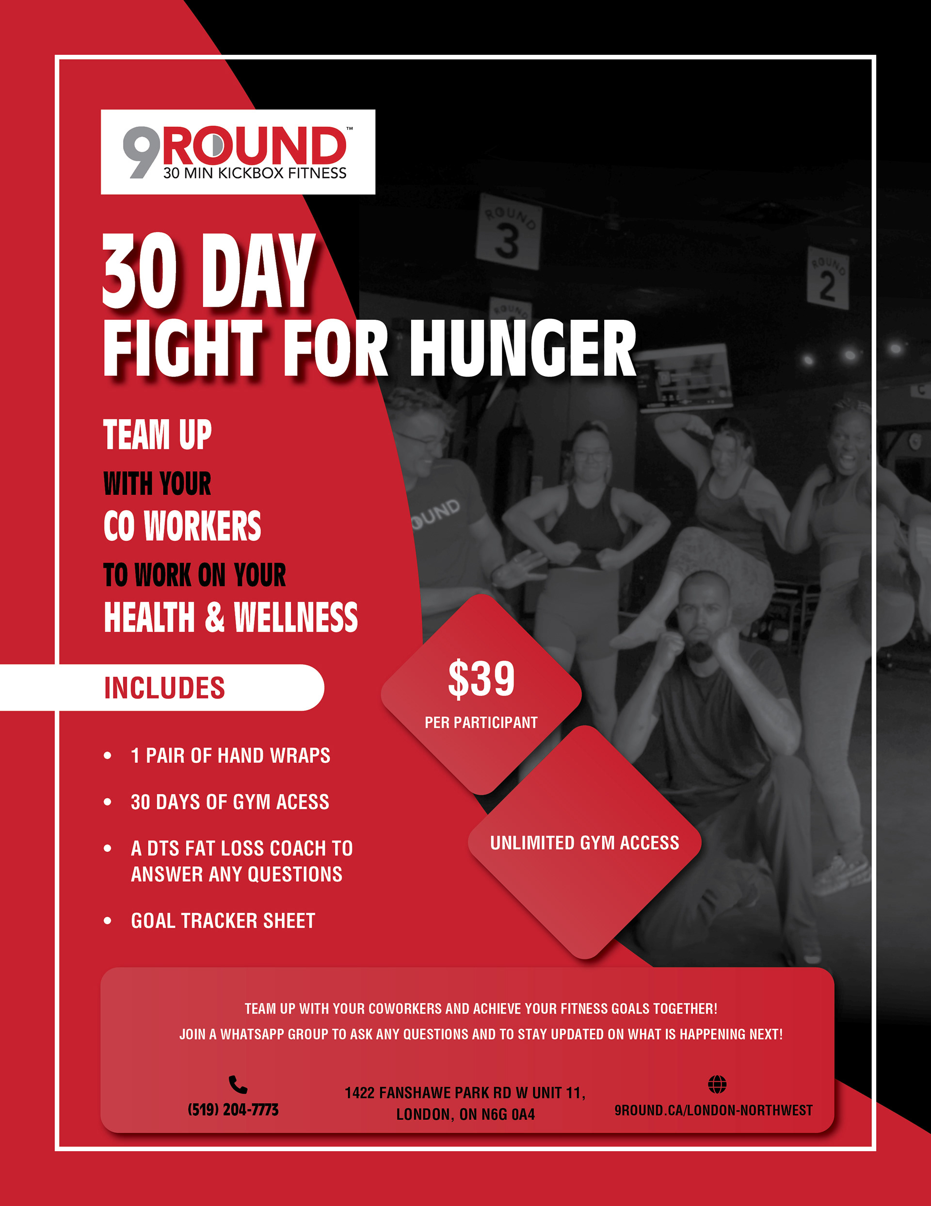
For this assignment, I was tasked with designing a poster to promote a challenge taking place at my gym. The key elements included featuring the date, sale details, donation information, and contact details.
Process
I incorporated reds and whites to align with the company’s logo and branding. However, accommodating all the required text as per the client’s request posed a considerable challenge. The hierarchy is meticulously structured, facilitating a smooth top-to-bottom reading flow for accessing all necessary information and comprehending the poster’s sales message. A user-friendly typeface, combined with strategically chosen colors to emphasize various details, enhances readability. To add a personal touch, I included a black and white photo of gym members engaging in a workout.
Medium/Tools Used
I utilized Adobe InDesign to assemble this project and employed Adobe Photoshop for editing, transforming the photo into grayscale.
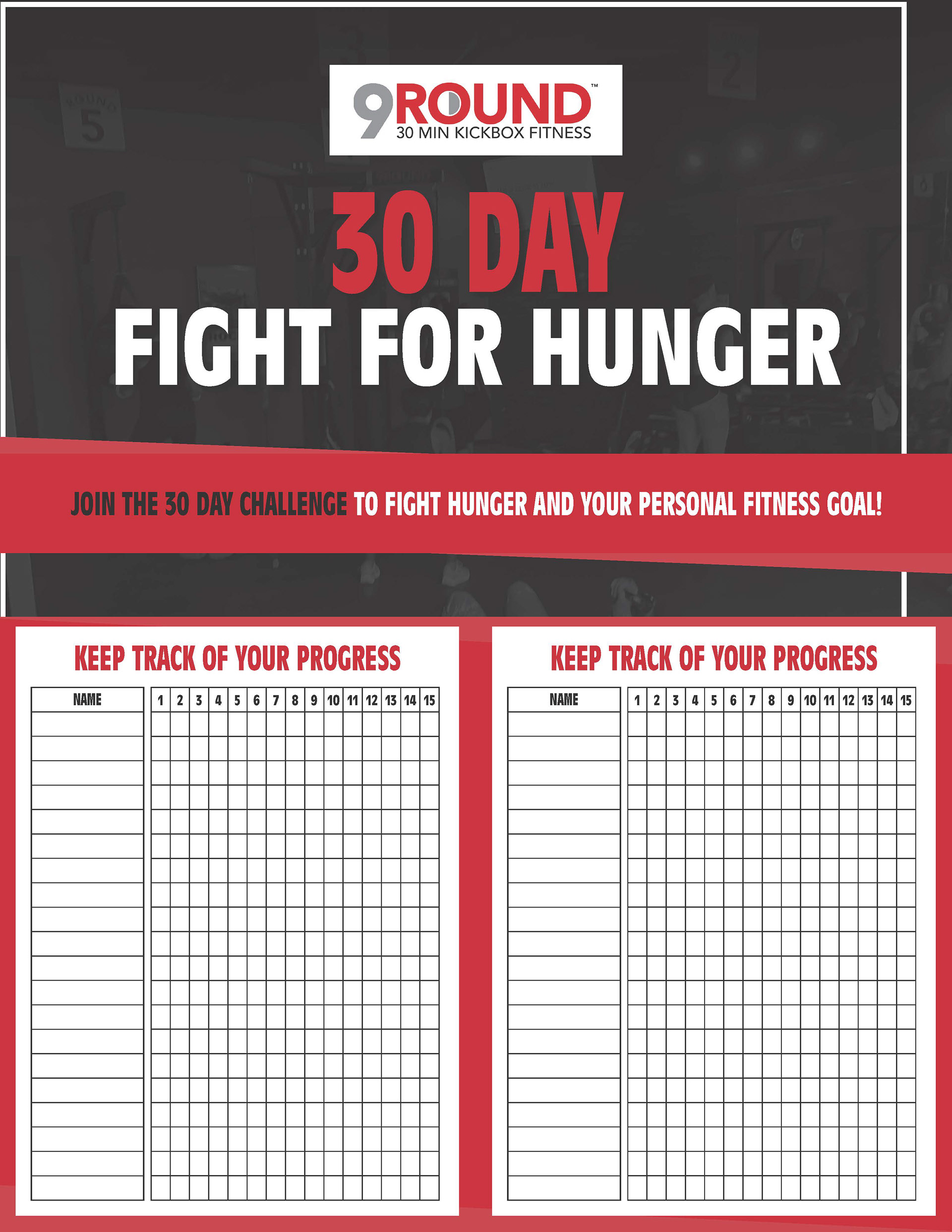
Chart
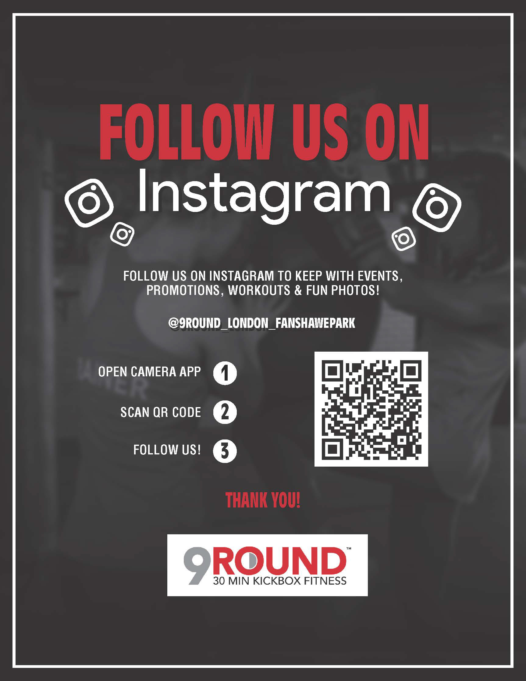
social media ad
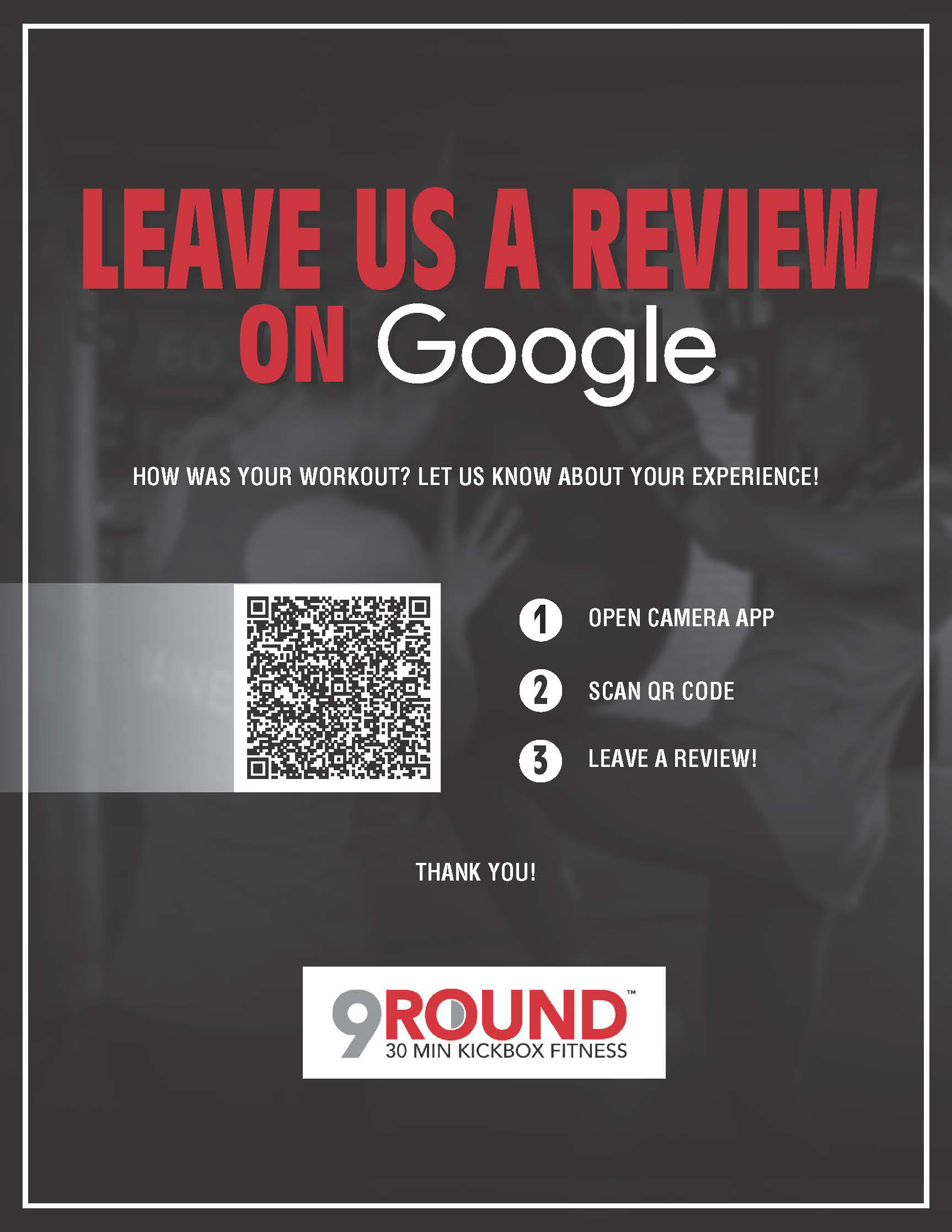
google review ad
second poster
